


Web APP
SaaS
UX/UI
B2B
About
Role
Product Designer
Platform
Web
Time
Aug 2022 - Apr 2023
Link
Overview
After joining Least in 2022, I collaborated closely with the head of product to boost user satisfaction by redesigning the product's interaction and interface. The web app, after all, are our core projects—a well-crafted website and app can empower the company across all areas and even make a notable impact in the industry. Furthermore, user experience is a critical aspect that demands extensive research throughout the redesign process. Indeed, this integrated overhaul subsequently drove significant user growth for the company.
Role
Design Lead
Timeline
5 months
Problems
UI
The use of the colour scheme does not make sense and leads to a heavy sense of dullness.
At the same time, all the designs use right angles, which are too sharp.
All components do not have hover state, click state and various interactive effects.
UX
"The user flowchart is not perfect and needs to be reorganised and planned."
Many pages have too many buttons and are spread all over the page.
The core functionality is too cumbersome for a smooth workflow.
The hierarchical structure in each page is not clear.
Challenge
" How can updates be made with minimal learning costs for existing users? "
Strategy
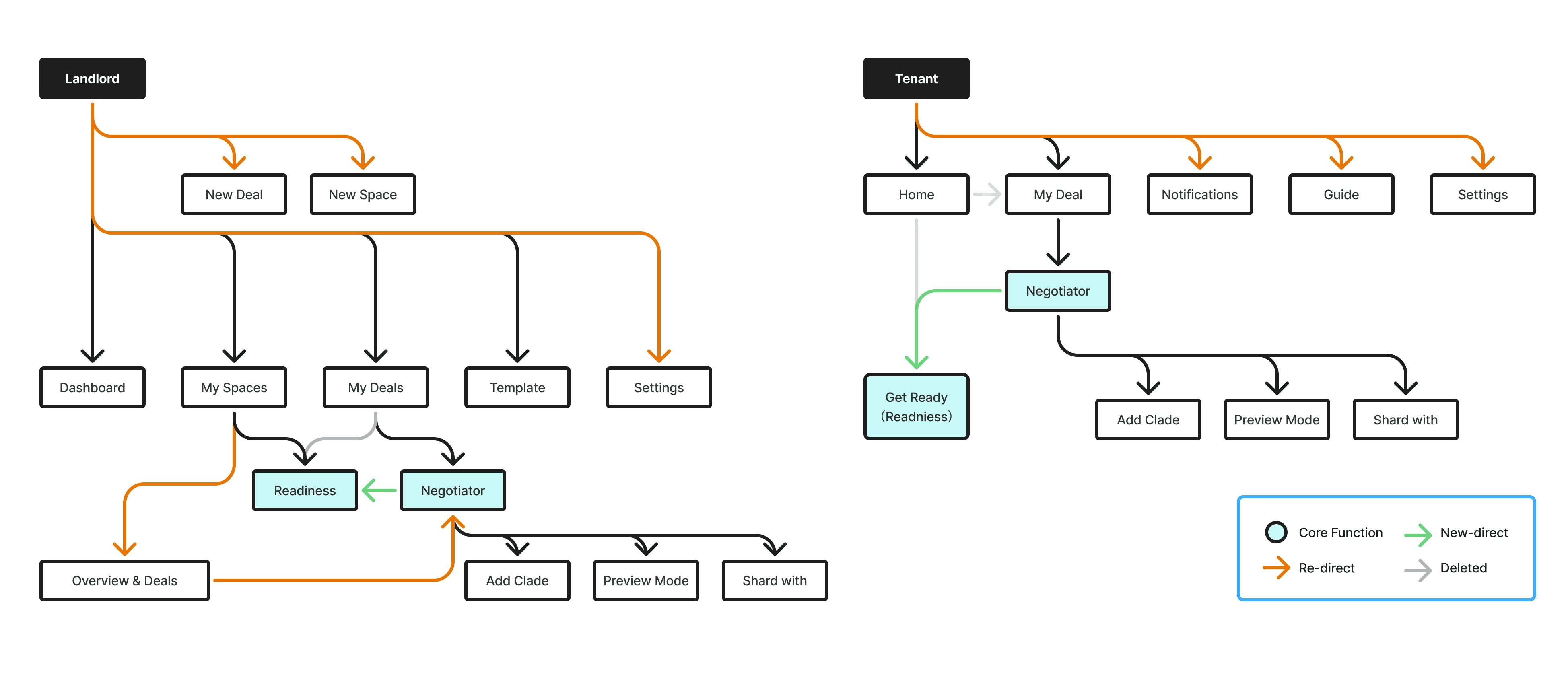
After conducting interviews with stakeholders alongside the head of product, we adjusted the functional framework of the entire app approximately 8-9 times based on user feedback and our own ideas, using the basic architecture diagram as a foundation. This was to ensure that existing users could quickly get back on track even after our updates.
Design
Brand new top navigation bar
In the new design, we moved the main navigation bar from the left to the top.
This was mainly because interviews revealed that clients need to switch between projects to maintain consistency, while the old design limited them to one page at a time.
Additionally, the left-hand navigation bar in the previous design was often useless on core feature pages, taking up space and complicating redesign efforts.
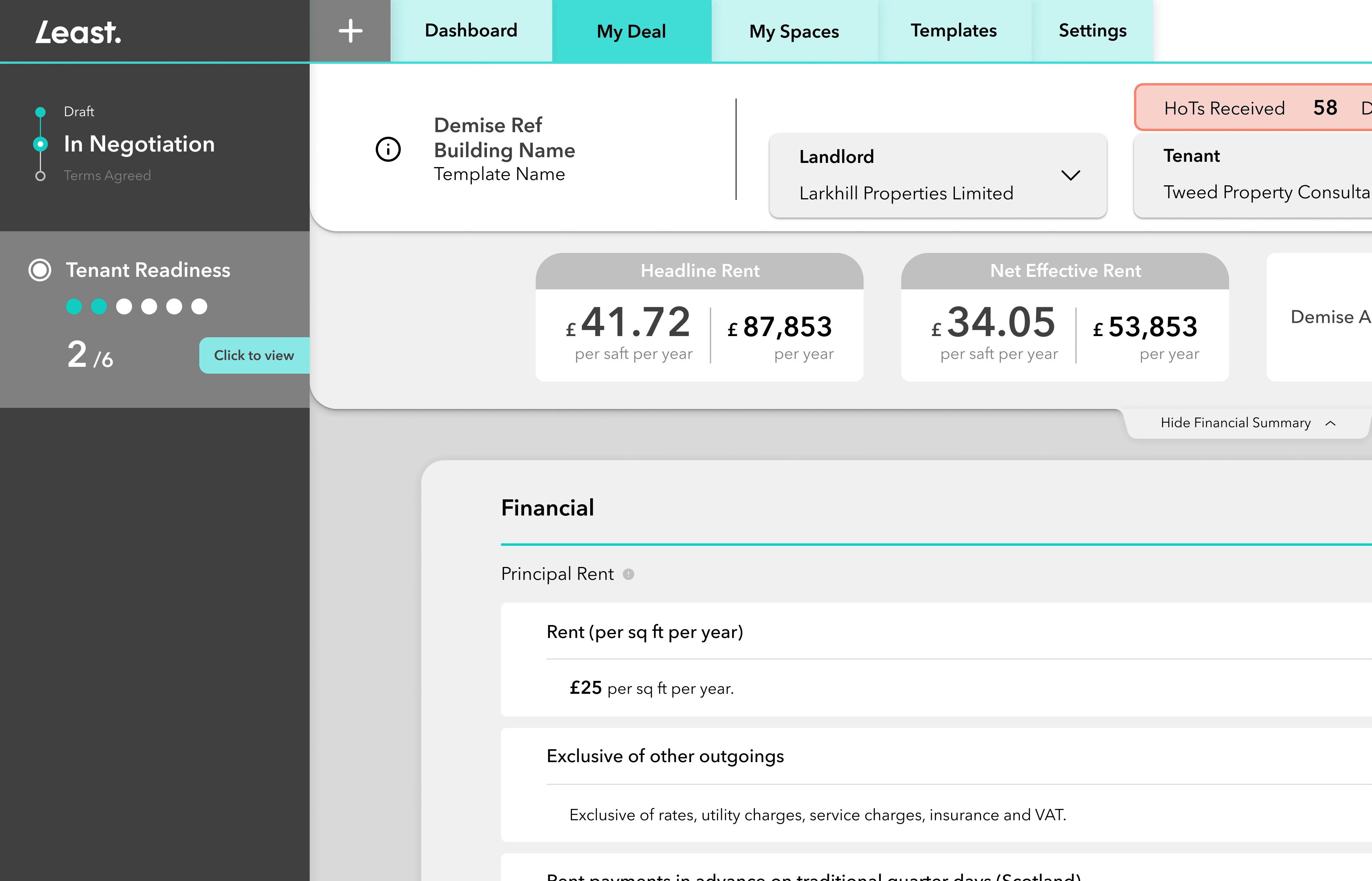
Brand new Deal page
Backend data shows that the Deal page, our core feature, has the highest click-through rate and longest user dwell time, as it contains critical data requiring detailed checks.
In the new design, I enhanced readability across all sections, particularly for large figures, using suitable designs to ensure broader adaptability in future use.
Integration of Readiness (core feature) into related pages
Readiness, our unique feature, has not received the attention it deserves from users before. In the new design, we’ve repurposed the former left navigation bar space for Readiness and added reminders to highlight its importance at any time. (More details in Project Two.)
In the new design, we’ve repurposed the former left navigation bar space for Readiness and added reminders to highlight its importance at any time.
(More details in Project 2)
Full App Update Responsive Design
After discussions with the development team, I designed responsive layouts for all app pages, ensuring users can seamlessly complete workflows on desktops, laptops, tablets, or phones, rather than being restricted to computers.

Beyond the highlights I’ve mentioned, I also redesigned numerous sections from scratch. Although many designs were later replaced during iterations, this update laid a solid foundation for the design system we established afterwards.
The Result
There were several highlighted comments in the 30 returning customer survey documents:
"Smoother to use"
Two months after the release of the new version, Readiness has seen a significant increase in completion highlights:
Number of registered users
Number of Active Users
Project 2: Readiness
Overview
The Readiness feature from Least is a comprehensive tool aimed at helping property managers and other stakeholders maintain efficiency in commercial leasing. It ensures all necessary documents and information are prepared, thereby speeding up transactions. By offering a centralised platform to store and manage property data, track the progress of lease negotiations, and ensure adherence to industry standards, this feature helps minimise delays and boosts overall efficiency.
Role
Design Lead
Timeline
2 months
The Problem
UX
"Users often overlook Readiness, only to regret completing it too late and wasting time again."
Within the current structure, the Readiness feature and Leasing content present a mutually exclusive choice, making it challenging for users to avoid prioritising the completion of Leasing content first.
Once users enter the Readiness workflow, it becomes virtually impossible to complete all tasks in a single session.
The page lacks clear indicators of Readiness progress, which makes it difficult for users to re-enter and complete it later.
Challenge
" How can we improve the Readiness completion rates? "
Strategy
1
2
Based on this, I hypothesised that integrating Readiness with content customers prioritise early on, paired with reminders, would boost its click-through and completion rates—since customers also want to avoid wasting time later.
3
Fortunately, the proposal to reposition the main navigation bar had already been reviewed and unanimously approved, leaving ample space on the relevant pages for redesign and integration of Readiness.
Design
Readiness re-locates
On all pages containing Readiness, update the position of the original left navigation bar to the Readiness functional area.
Multiple progress reminders within the app
On all pages containing Readiness, update the position of the original left navigation bar to the Readiness functional area.
The Result
Two months after the release of the new version, Readiness has seen a significant increase in completion highlights:
Readiness average completion rating
From 12.2% to 46.4%
Lease completion time


