


Web APP
SaaS
UX/UI
B2B
Company
Role
Product Designer
Platform
Web
Time
Mar 2023 - May 2024
Link
Case study 1 :
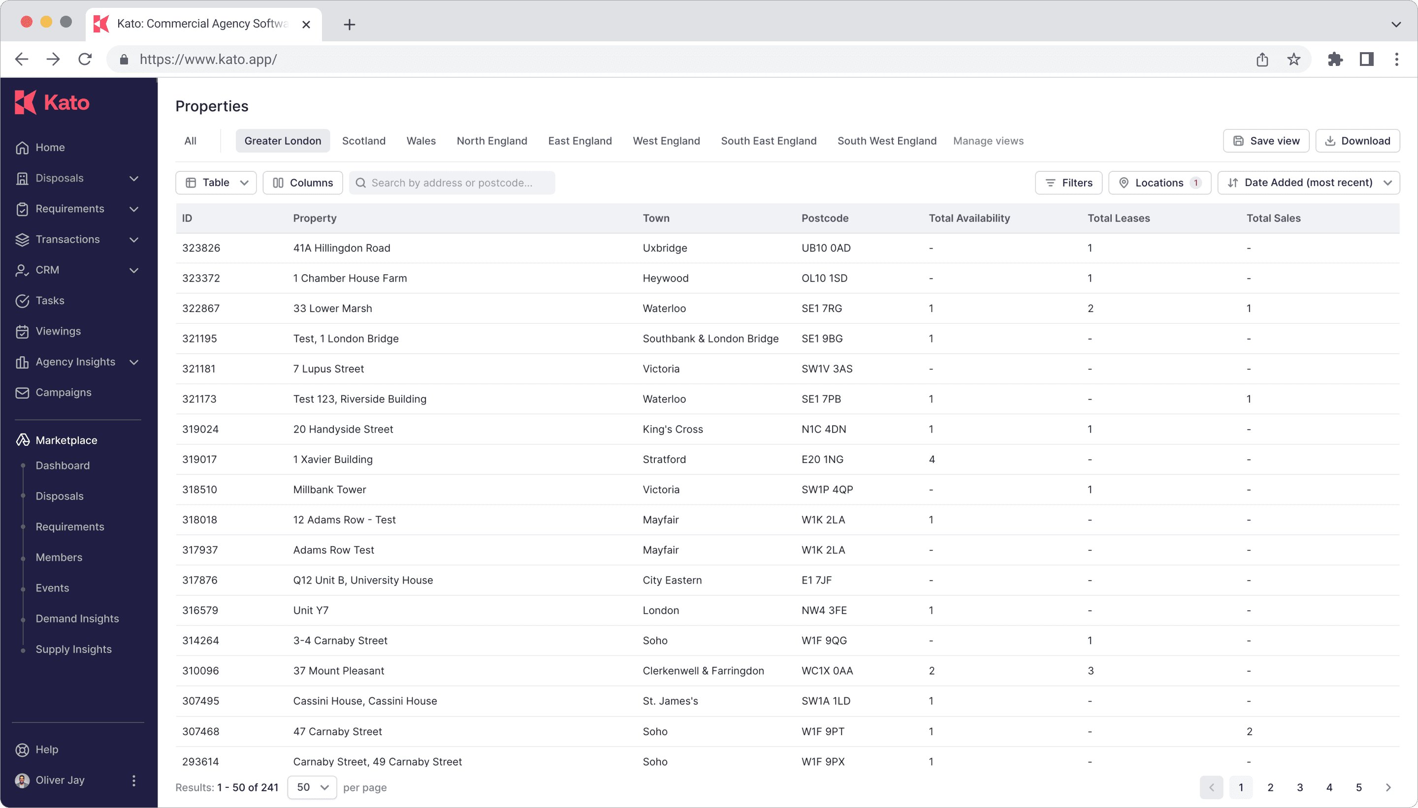
From "Define Space" to "Properties & Stacking plan"
Overview
In this case study, I walk through the full design process I led at Kato, from initial request to final release. In December 2024, we launched a new ‘Properties’ page for our enterprise clients — a feature aimed at giving agents a clearer, more efficient way to compare and manage listings, while also offering team leaders a high-level view to manage team assets.
Interestingly, this feature wasn’t originally planned — it grew organically from a much smaller UI improvement and developed into a significant product shift.
Role
Sole Product Designer - Owned all design solutions from start to finish. Partnered with PM to conduct user research, ideation, and usability testing. Closely collaborated with engineers to align logic, data structure, and ensure smooth integration with existing workflows
Teams
Timeline
4 months from scope to launch
Part 1 :
Improving "Define Space" Availability
Context
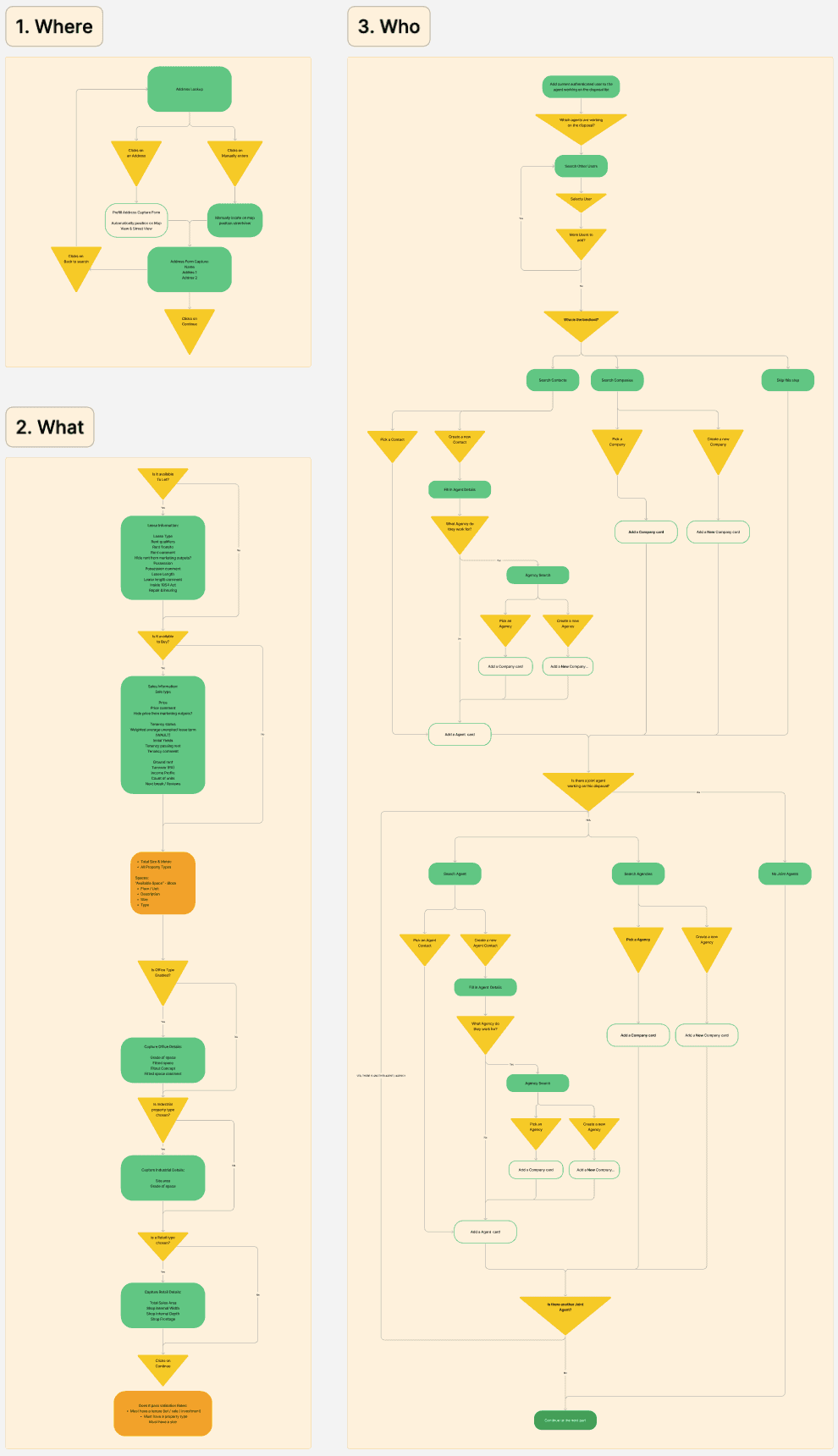
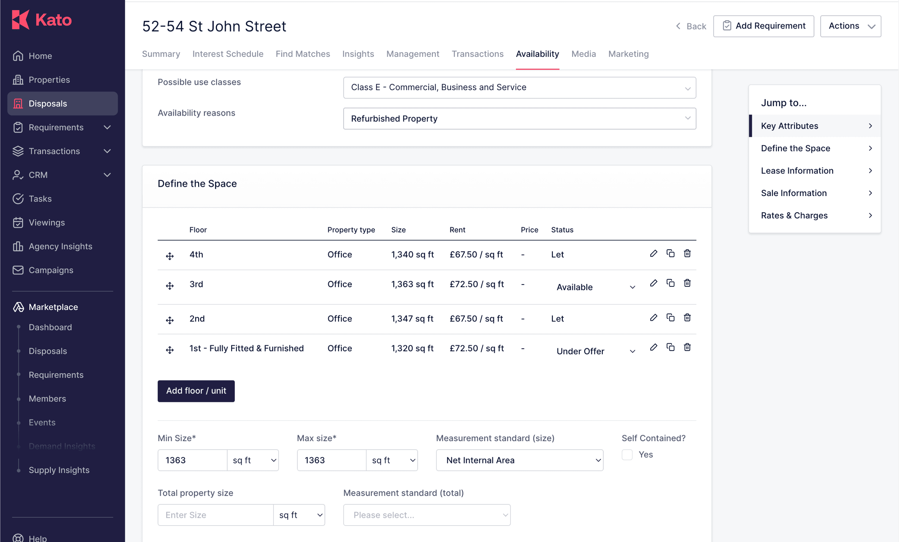
Availability page acts as the central hub for all key property disposal details. When agents list a property disposal, they are required to input core information here — such as size, type, ceiling height, and whether the property is for sale, lease, or both.
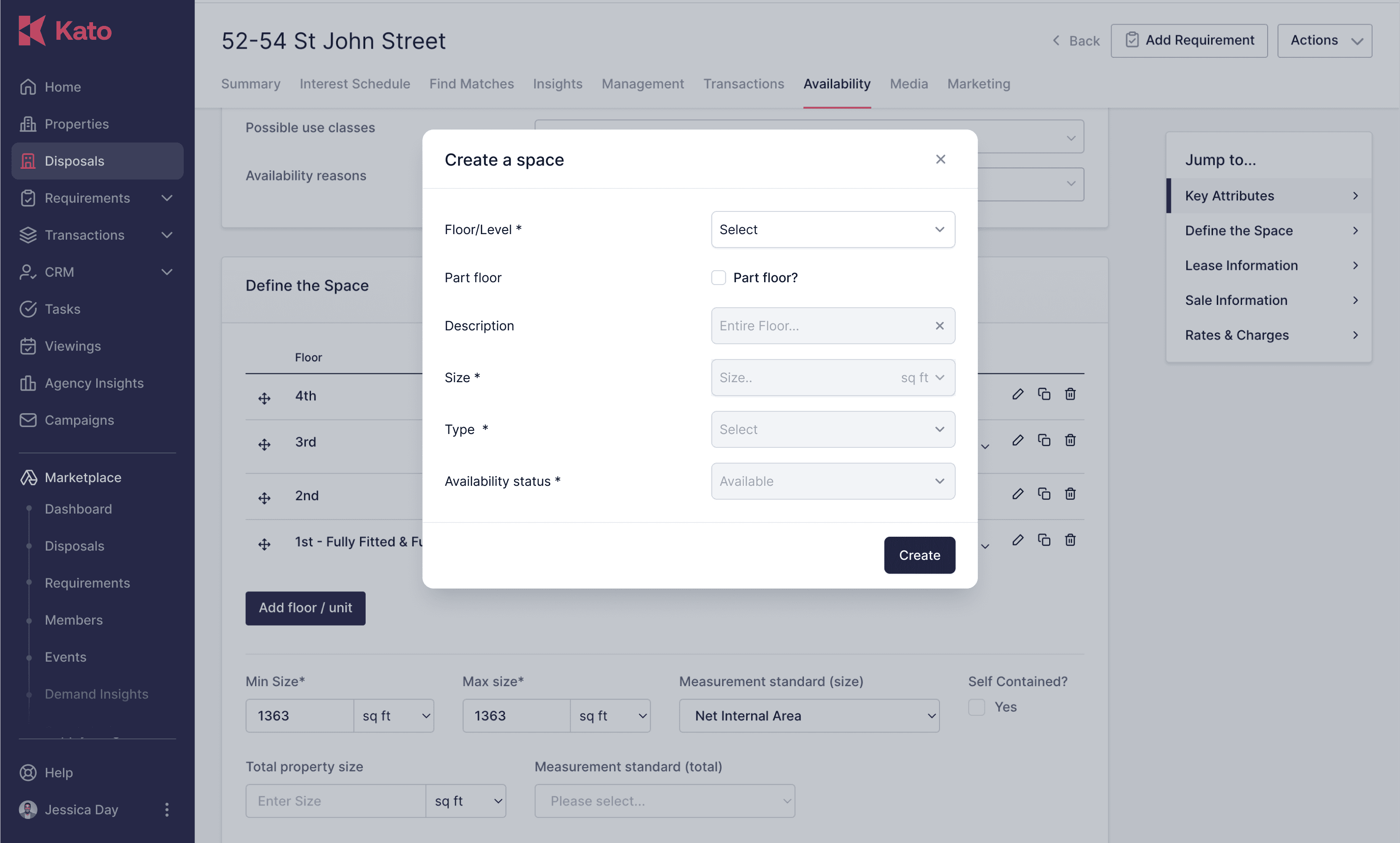
One key feature within this page is Define Space, which allows agents to specify the size, floor level, and internal subdivisions of the property. However, due to a variety of factors, this section is often left unchanged after its initial setup — with many entries remaining in their default state long-term.
Goal
Rethink and streamline the Define Space interaction model, ensuring it aligns more closely with how agents naturally work.
By making the experience more intuitive and context-aware, we aimed to encourage more complete and accurate data input — ultimately improving the overall quality and usability of listings on the platform.
Kick off meeting
The problem to be addressed
What is already known regarding users needs
Define the project MVP
Technical and business constraints
Gaps in understanding regarding content and functionality
Interview
5 x Agents
User
CTO & Founder
Stakeholder
4 x Sales reps
Stakeholder
2 x Account Managers
Stakeholder
Understand business and success metrics
Define the purpose of Define Space feature
Unpack the reasoning behind the current workflow and its sequence
Pinpoint the most critical information agents need to complete
Diagnose existing usability and structural issues within the current experience
Define the Problem
The feature is buried too deep within the platform, making it difficult for users to discover.
The interaction flow is unintuitive and requires a steep learning curve.
Key information isn’t surfaced clearly, which affects usability and comprehension.
The feature feels siloed and disconnected from the wider user journey.
Information Architecture
Design
High-fi Design

Twist:
"Wait — isn’t this the core piece Property View was looking for"
During the review of the Define Space, the CTO and Head of Product realised this was exactly the direction they envisioned for a long-discussed feature: Property View.
On the spot, the project pivoted. I was asked to wrap up the current work within 3 days and move on to design a new feature.
Part 2 :
"Let's dive into the stacking plan and build the property view!"
Context
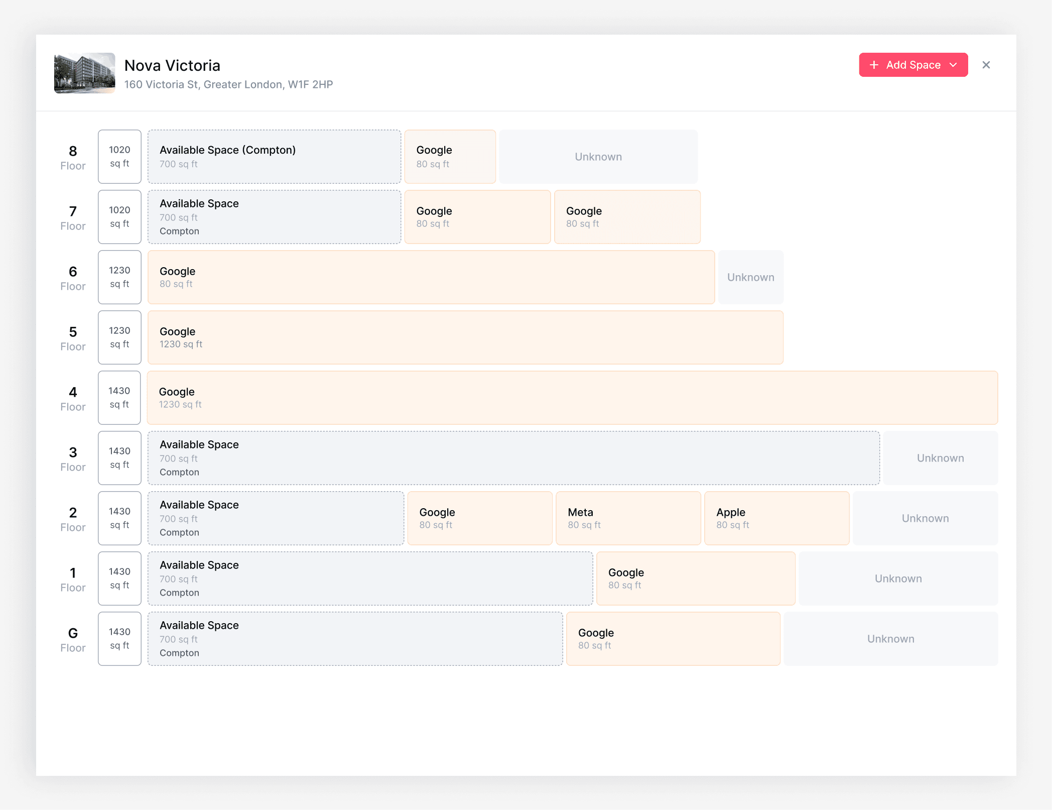
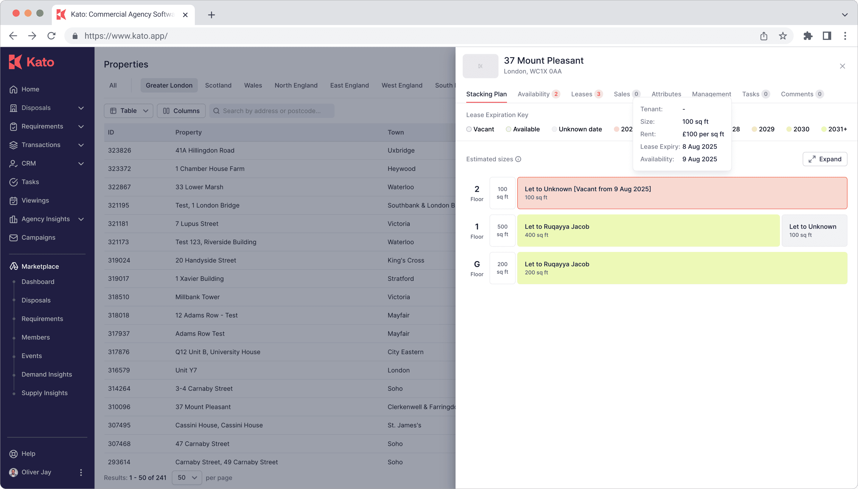
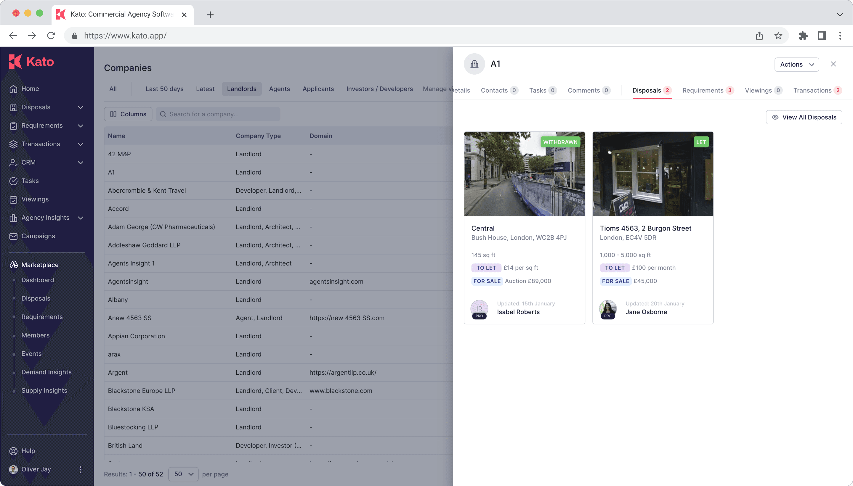
Properties View introduced a completely new perspective — instead of treating listings as individual units, it allows users to view an entire building as a single, consolidated entity based on its address. All relevant information — including availability for rent or sale, historical records, and more — is aggregated into one place and easily accessible with just one click.
The newly designed Stacking Plan view became the catalyst for launching this project. It perfectly aligned with stakeholder expectations and vision, offering a simple and intuitive way to visualize every detail within a building at a glance.
Process
Kick-off Meeting
The CTO and Head of Product had already mapped out their initial understanding of the framework. During the project kickoff, we had an in-depth discussion with the development team to align on the structure and ensure everyone was on the same page.
With several important client meetings scheduled in just 3 weeks, the CTO was keen to have a polished prototype ready to present as a key selling point.
Concept

Timeline
Week 1 – Research
Held a meeting with the CTO, Head of Product, and engineering team to confirm business goals and user needs.
Set up the project board with PM in Jira, created Epics for Design and Research, broke tasks down by milestone.
Reviewed previous Availability feedback and conducted quick user interviews with sales and account managers to validate assumptions.
Synthesised research findings using affinity mapping and mapped out the user flow for both Availability and the proposed Properties View.
Week 2 – Lo-fi Design & Team Alignment
Created low-fidelity wireframes in Figma, outlining user flow and the stacking plan structure.
Hosted design review sessions with product and engineering to ensure feasibility and alignment.
Iterated based on feedback, finalised the information architecture.
Week 3 – Hi-fi UI & Prototyping
Delivered full high-fidelity designs using the design system, ensuring responsive design and dev-ready component structure.
Built a clickable prototype in Figma for internal testing and presentation.
Collaborated closely with engineers to help them clarify data structures related to the stacking plan.
Week 4 – Testing, Handoff & Client Presentation
Conducted internal usability testing sessions and implemented key improvements (e.g., layout simplification, tooltips for complex data points).
Completed handoff in Figma, including Inspect-ready files, redlines, and dev notes.
Delivered a live walkthrough of the prototype with the CTO in preparation for client demo.
Prototype showcased during a pitch with key enterprise clients, helping to secure new deals and mark a successful entry into the EU market.
Launched


Case study 2 :
CRM
Overview
Customer Relationship Management (CRM) is a powerful feature of the KATO app, tailored for commercial property professionals to manage and nurture client relationships effectively.
As a product designer on the feature team, we work closely with the sales and development teams to refactor and innovate the CRM feature in order to increase the usage of the feature and improve user access.
It centralizes client data, tracks interactions, and organizes leads, enabling users to prioritize opportunities and streamline communication with tenants, landlords, and other stakeholders.
Role
Product design
Timeline
2 months
Launched


Case study 3 :
Kato Design System
Overview
As a product designer, I collaborated with a senior product designer on the Kato Design System, a project that merged creativity and precision to enhance the experience for commercial property professionals. Together, we developed a high-fidelity design system, standardizing UI components, typography, and interaction patterns across the platform, ensuring consistency.
My role focused on translating complex workflows into an intuitive, scalable framework, while benefiting from senior expertise to refine the balance of aesthetics and functionality. This teamwork resulted in a visually cohesive, user-centric PropTech solution that boosts efficiency and engagement in a competitive market.
Role
Product design
Timeline
2 Weeks


