


Web APP
SaaS
UX/UI
B2B
Company
Role
Product Designer
Platform
Web
Time
Mar 2023 - May 2024
Link
Case study 1 :
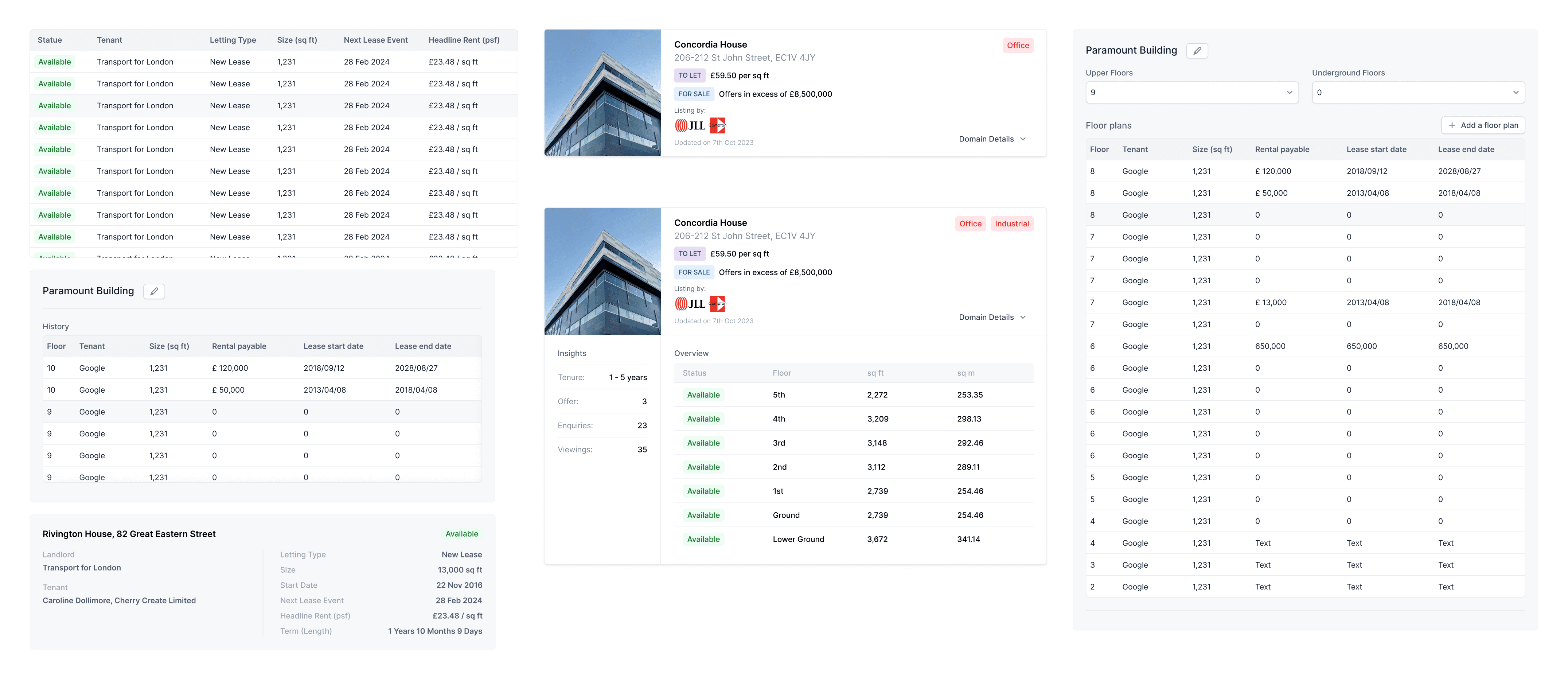
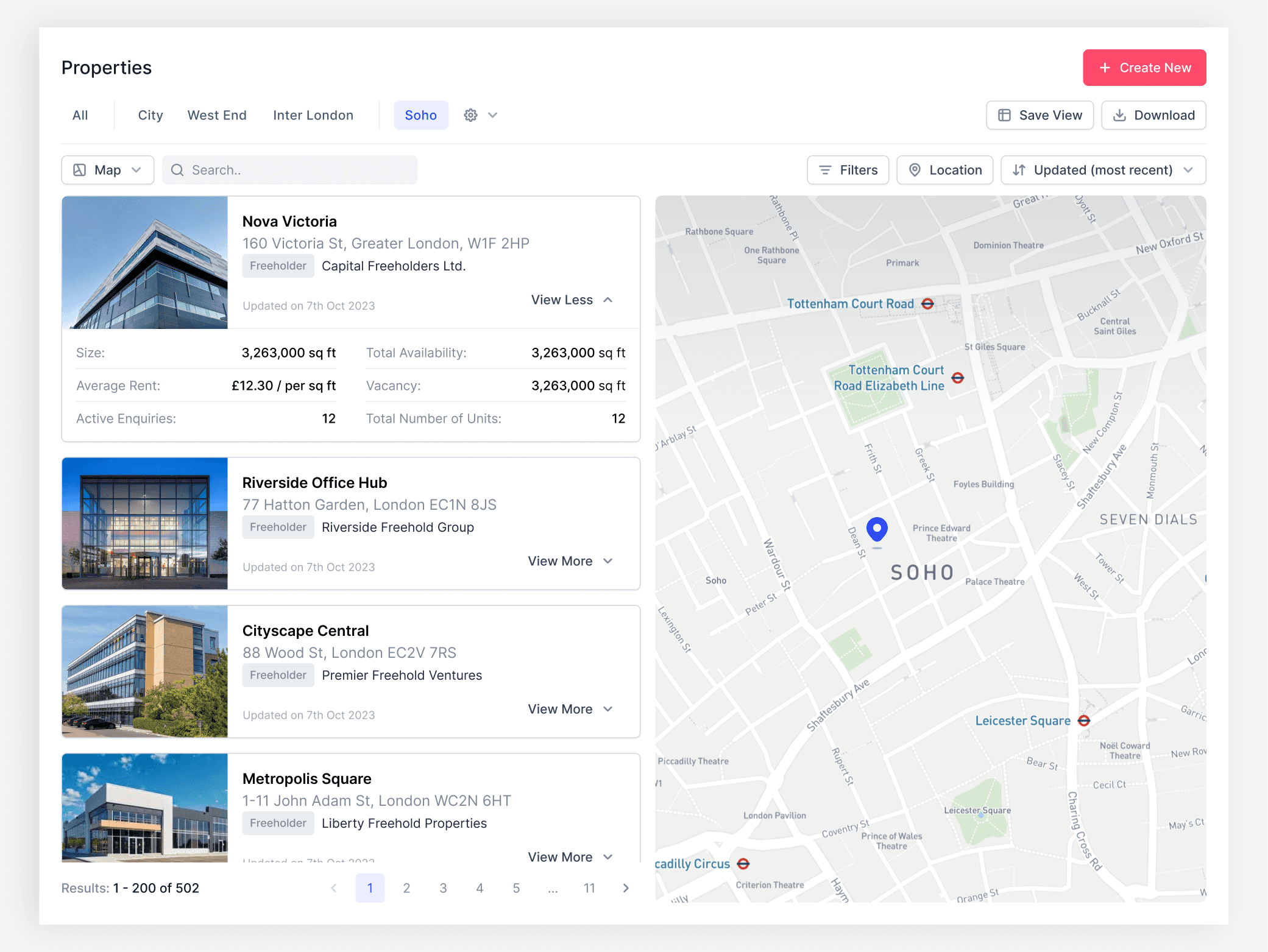
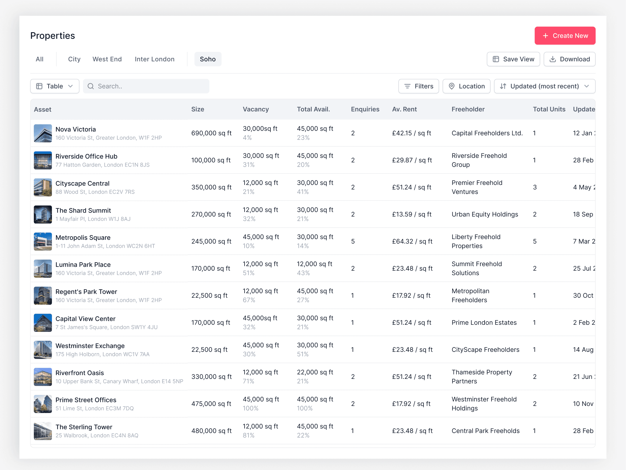
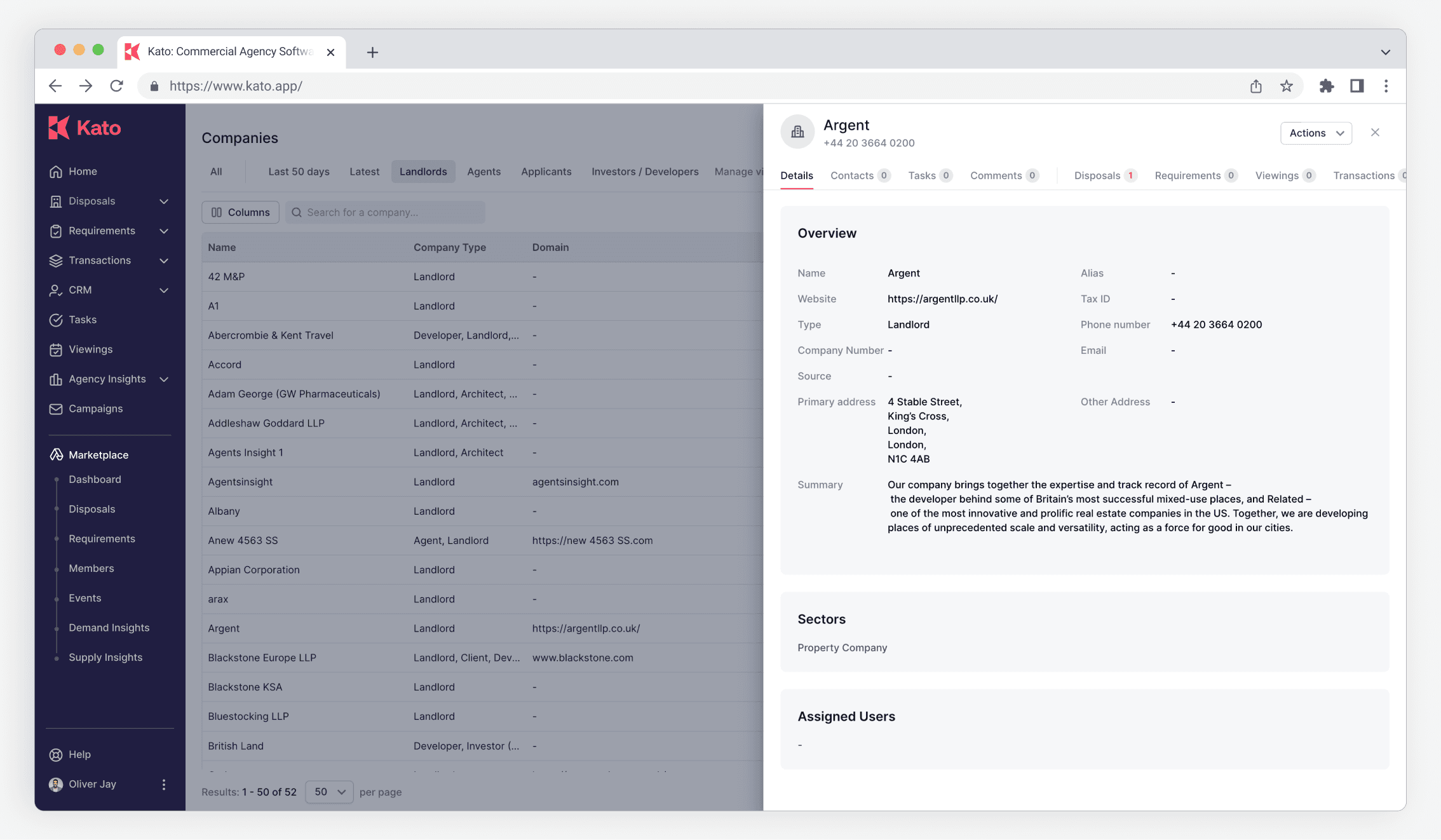
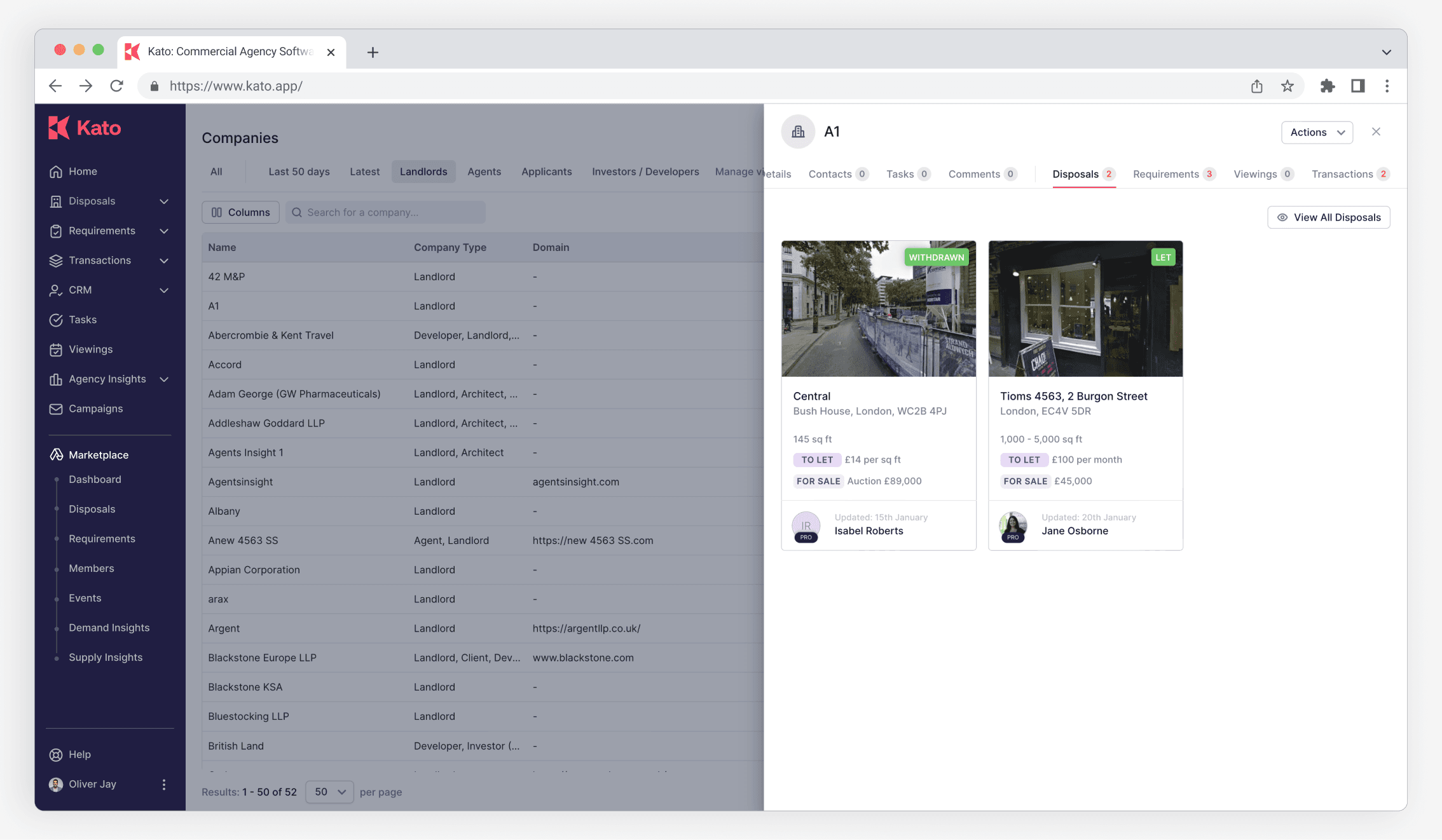
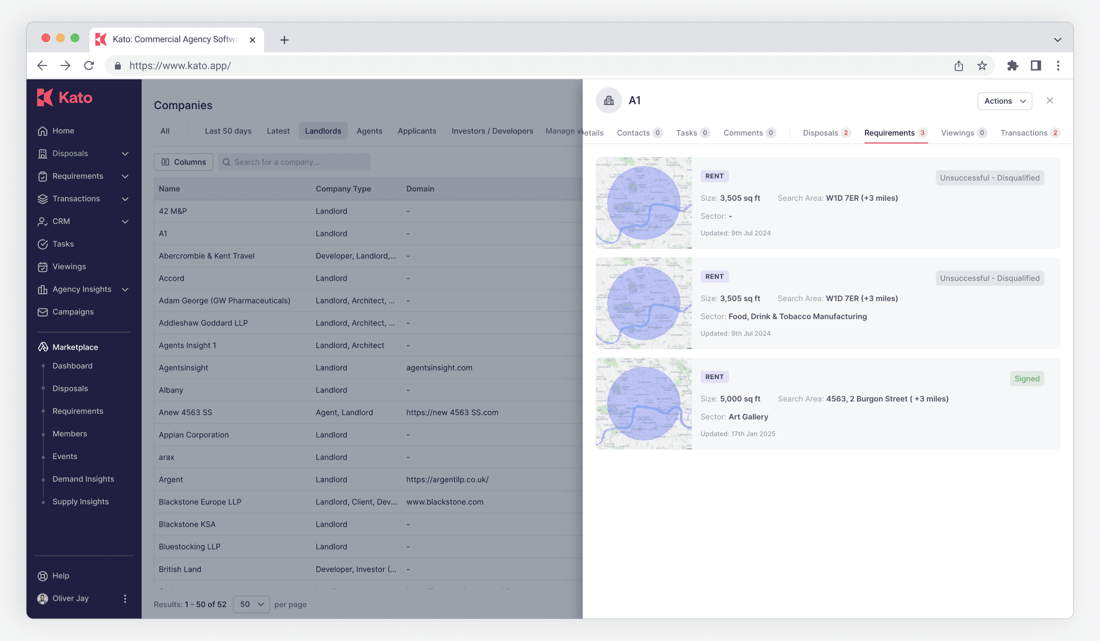
Property View - A Unified View for Commercial Property Insights
Overview
As KATO app is a B2B commercial real estate platform, our users often deal with complex, multi-space buildings that feature multiple subdivided units across various floors. However, before the launch of the Property View feature, users had to manually filter through individual disposals—each with varying levels of detail—resulting in a fragmented and inefficient browsing experience. They often needed to open multiple pages and compare listings one by one just to get a complete picture of a property.
Property View was designed to solve this problem by consolidating all relevant data tied to a specific property address into a single, comprehensive view. This significantly streamlined the workflow, helping users quickly assess leasing options across all units and floors.
Role
Sole Product Designer - Owned all design solutions from start to finish. Partnered with PM to conduct user research, ideation, and usability testing. Closely collaborated with engineers to align logic, data structure, and ensure smooth integration with existing workflows
Teams
Timeline
4 months from scope to launch
Kick off meeting
Defined the MVP
A consolidated property view showing all existing space-related data tied to a real address
Long-term vision
Provide a single entry point for understanding the entire building at a glance.
Interview
Collaborating closely with the project manager, I conducted in-depth interviews with 10 stakeholders, including:
5 x Commercial agents
Primary User
Team leads
Stakeholder
4 x Sales reps
Stakeholder
2 x Account Managers
Stakeholder
Objectives:
Understand the broader business goals
Identify key success metrics and how they are measured
Clarify the strategic value of the Property View feature
Uncover the reasoning behind the current process flow and sequence
Pinpoint the most critical information users seek when viewing a property
Affinity Diagram to organise the notes
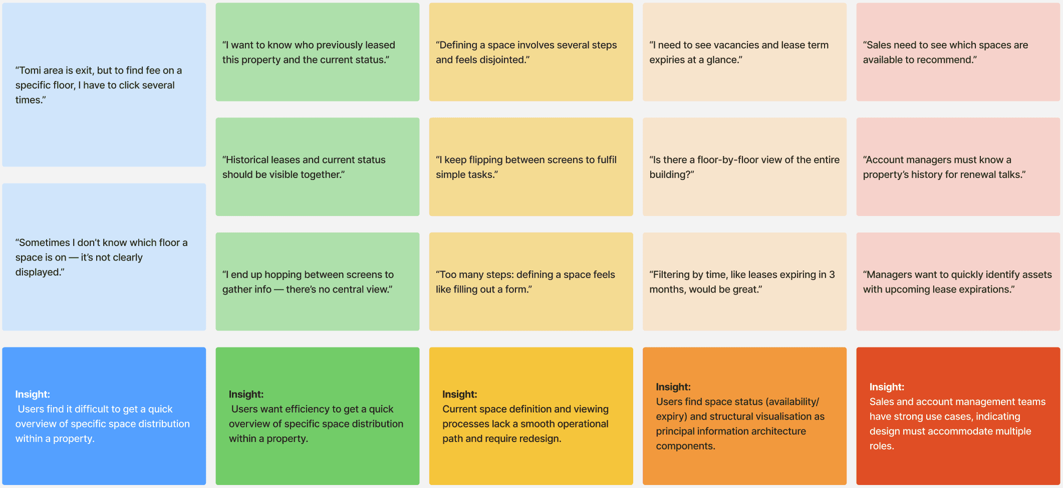
Problem Definition
“ How might we help agents quickly understand the details of the property, while allowing managers to monitor all properties across the team? ”
Design
Information Architecture
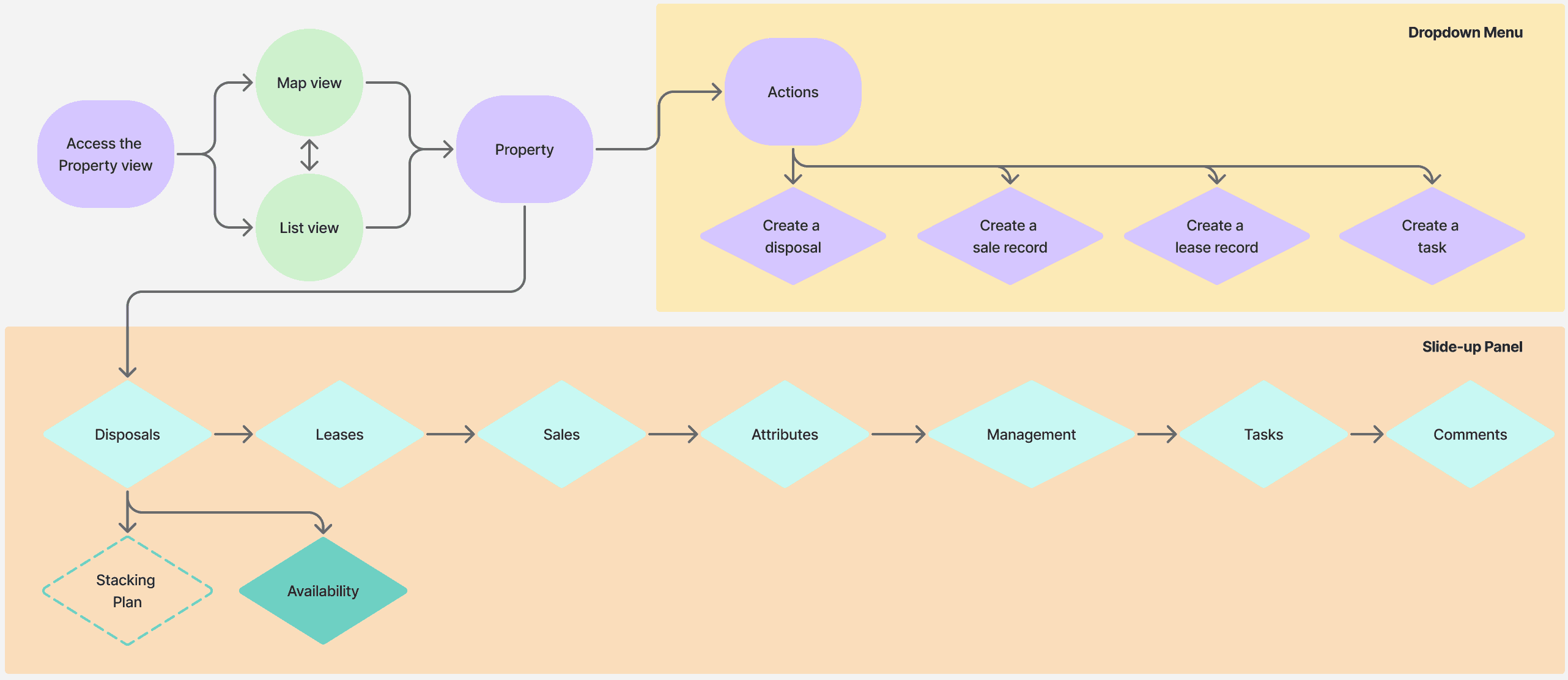
Exploration
For data-heavy pages - Stacking plan, we used data visualisation.

Prototype
Feature key experiences
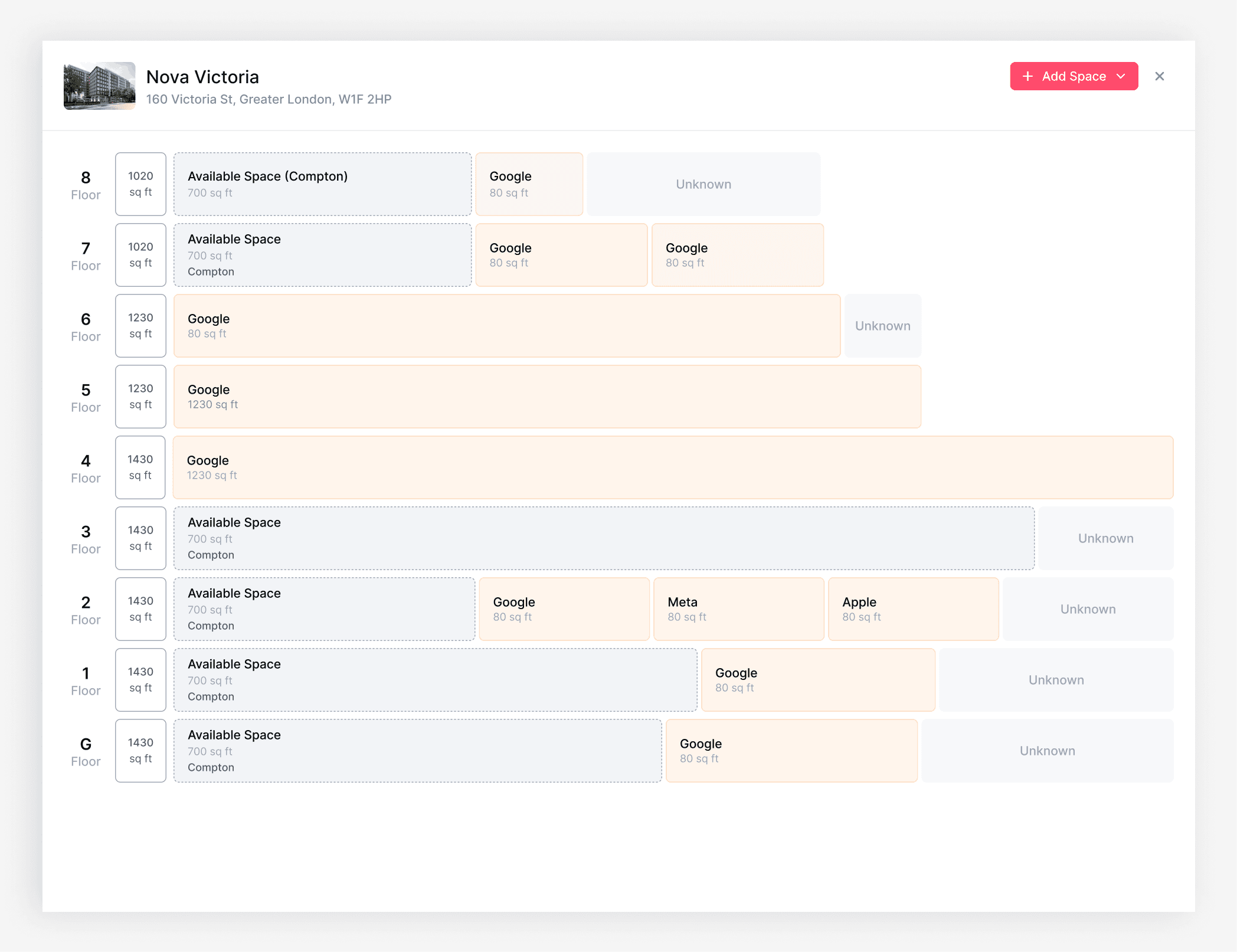
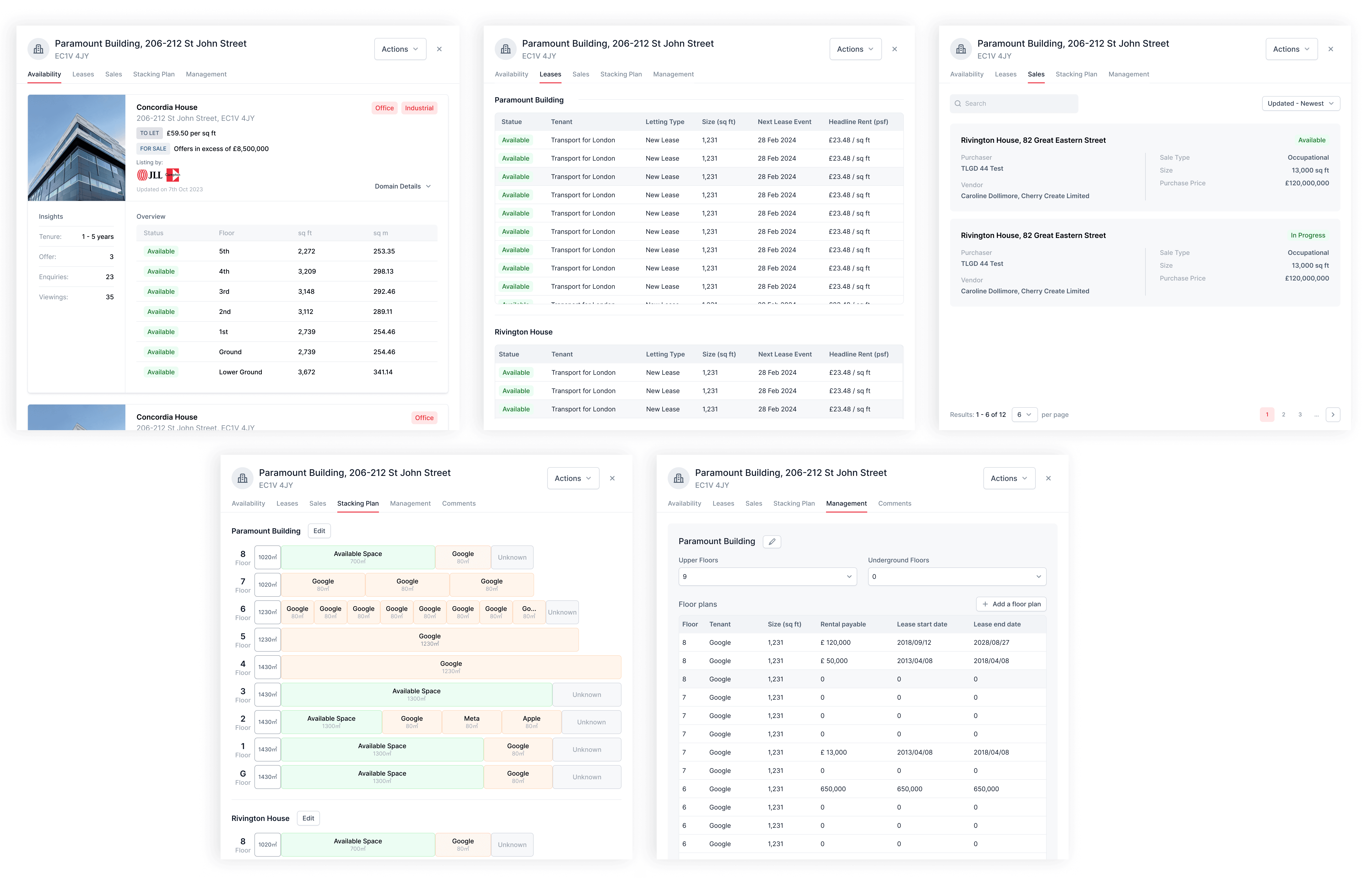
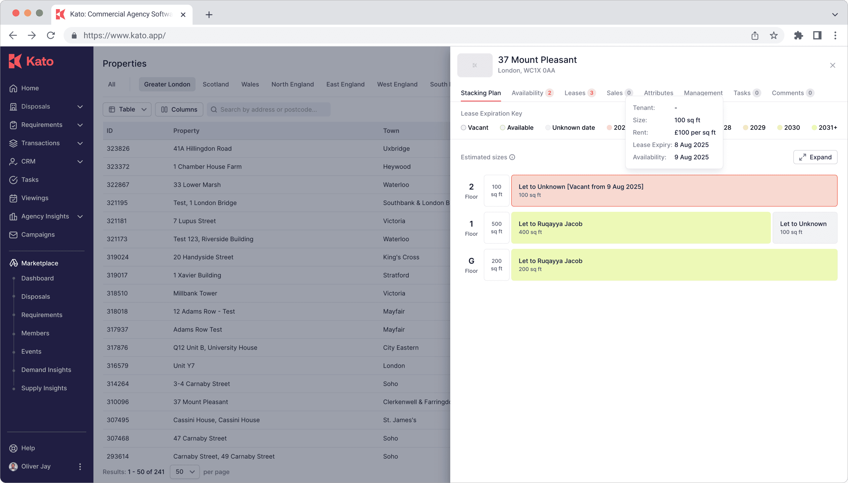
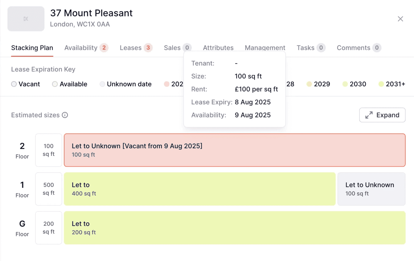
Stacking Plan as an Information Hub
In the Stacking Plan, we visualised available spaces by floor and turned raw data into an interactive layout.
Users could hover to get more info, so they didn’t have to dig through multiple tabs.


Team-Based Filters Instead of hierarchy
We introduced a customisable filter on the Property View list page. Team managers could quickly toggle between team resources using preset filters, offering a bird’s-eye view of property allocations.
Clear Categorisation of Related Info
We grouped things like leasing history, sales records, and disposal activities under one scrollable panel.
That way, users could view all relevant records of a property in one place.

Scalable Component-Based Panel Design
We built the interface using reusable components so the system could scale and support future updates.
Iteration & Enhancement
Based on usability testing and review feedback, we added several ancillary features to optimise the user experience before the product was released:
Colour-coded expiry indicators
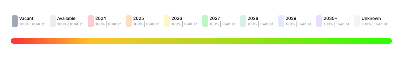
We introduced a visual colour scheme to represent different lease expiry timeframes directly within the Stacking Plan and Table View.
This feature allowed agents to quickly assess urgency levels and prioritise client outreach.
Expandable building view
The Stacking Plan was designed to be collapsible by default, enabling users to expand individual buildings only when needed. This ensured the interface remained scalable for large multi-property portfolios while still providing deep drill-down capabilities.

Redesigned Table View & integrated Map View
Case study 2 :
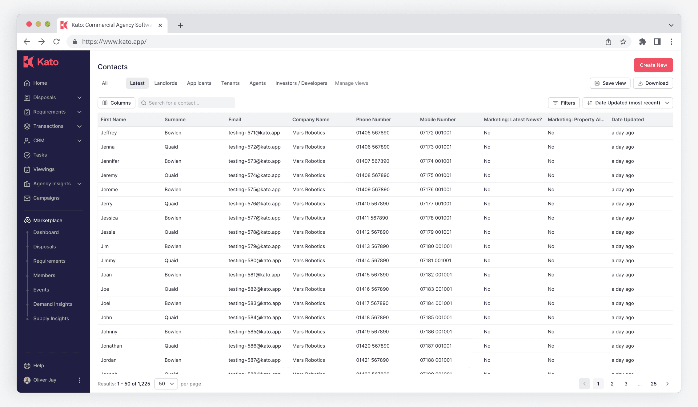
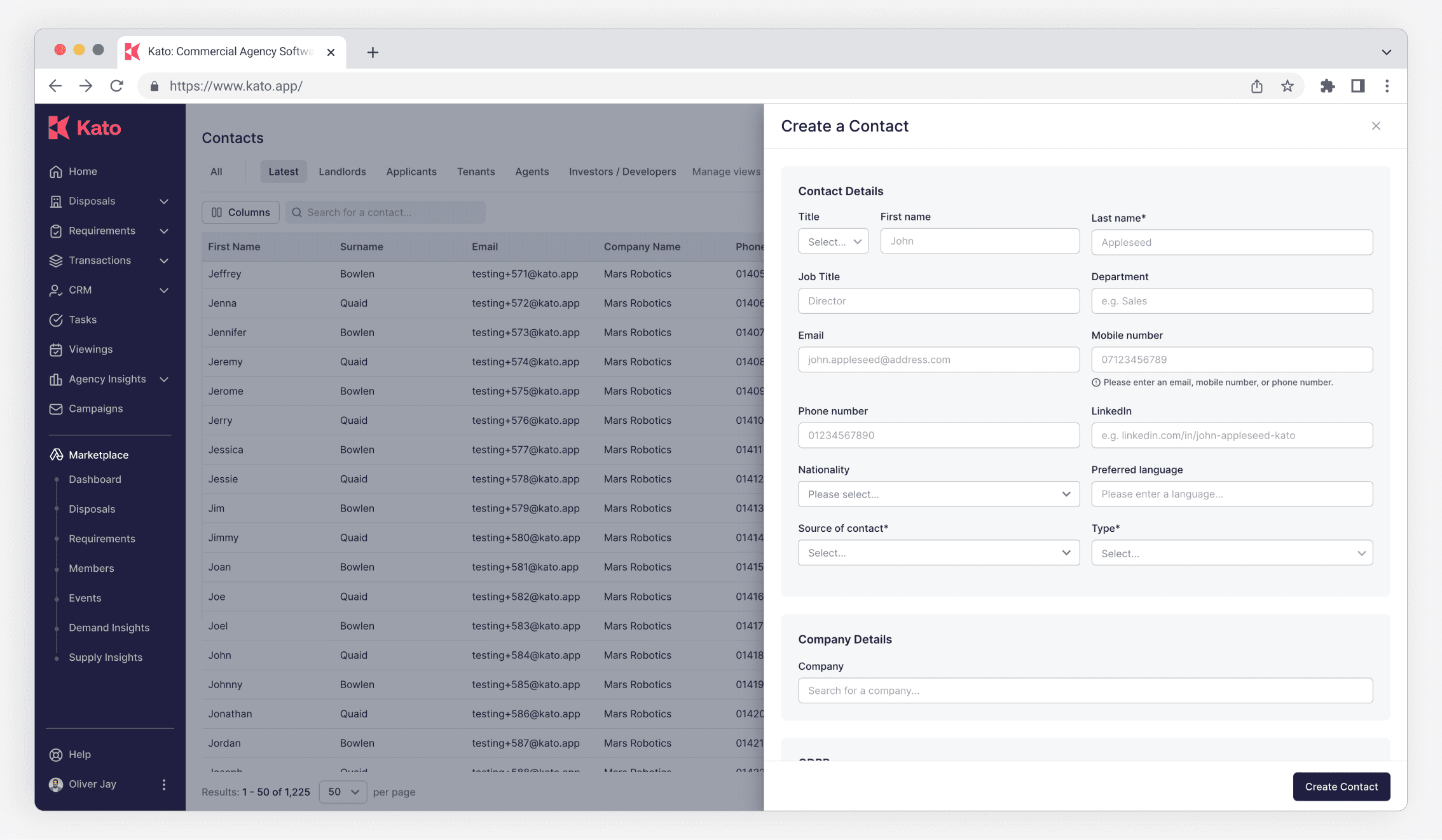
CRM
Overview
Customer Relationship Management (CRM) is a powerful feature of the KATO app, tailored for commercial property professionals to manage and nurture client relationships effectively.
As a product designer on the feature team, we work closely with the sales and development teams to refactor and innovate the CRM feature in order to increase the usage of the feature and improve user access.
It centralizes client data, tracks interactions, and organizes leads, enabling users to prioritize opportunities and streamline communication with tenants, landlords, and other stakeholders.
Role
Product design
Timeline
2 months
Launched page

Case study 3 :
Kato Design System
Overview
As a product designer, I collaborated with a senior product designer on the Kato Design System, a project that merged creativity and precision to enhance the experience for commercial property professionals. Together, we developed a high-fidelity design system, standardizing UI components, typography, and interaction patterns across the platform, ensuring consistency.
My role focused on translating complex workflows into an intuitive, scalable framework, while benefiting from senior expertise to refine the balance of aesthetics and functionality. This teamwork resulted in a visually cohesive, user-centric PropTech solution that boosts efficiency and engagement in a competitive market.
Role
Product design
Timeline
2 Weeks + Keep updating


